Tuesday, December 30, 2014

The cycle

Sometimes I start on a project on a whim. For example, we venture to Lowes for this or that and we wonder with both our minds thinking, let's convince ourselves into something on our wish list that isn't "that" much. Sometimes reality and responsibility kick in and we both leave, heavy hearted hoping the other would have been the irrational money spender. 

Other times.. well, one of us breaks. My husband, when he breaks he becomes focused. Luckily for us both he usually takes on things that require a fixed amount of time and man power. So it gets done, in a nutshell. 

When it's me, it's usually something cheap that I'm going to do just "to make something better" but not permanent. Then I enter the cycle.

This is how it goes. I'm just getting this gallon of concrete paint for the basement to "test it out". Turns into "let's try it, it can't get worse." Enter me on a kid free hour testing it out, then testing a bigger place as I start to love it. I realize it's great, but maybe the color is off. So I buy more, and retint the original. Now I'm 2 gallons in. I venture to paint even more- thus creating a complete disaster of my basement. I love it do much I think, why temporary, this is awesome! 
This is the turning point. You know, where the temporary place holder becomes my DIY dream. Then I sink in. I google, I dream, I envision how this will all play out. 
Then reality hits. The kids spill water before the floor "cures" and I see how my family has a different version of "tough" on a surface. This is when I start to crumble. This is impossible, this will look awful, I didn't follow the directions on the can. Usually, this is when the kids are home and obviously not privy to my genius of home renovation glory. Then I lose my mind and want to throw in the towel.
I'll save the description of temper tantrum like texts my husband receives and my udder disappointment. Luckily, this means the 360 degree turn is on the way. I finally realize the disarray must go. I need my house back. My propane is mixing with fumes from the cement paint prompting a $85 call to the propane company to see if there's something wrong.
------side note: when vapors mix with your propane they cause a terrible smell but clean your copper while cooking, a happy side to the fear of our house exploding------
It's then I realize, WTF let's just go with it, it will be better then it was. Enter 360.

Trusting your house.. and being frustrated in the meantime

One of the frustrating aspects of buying an older house is finding that sense of trust. Trusting that its secure, trusting there is no hidden mold, or hidden defects just waiting to pop up. Along with that comes the fact that most, if not everything needs to be replaced. Old water filter, old water heater, thermostat, windows, etc etc etc.

As we continue to tackle renovating our house, I find myself optimistic, excited, but in all honesty - most of the time frustrated and hopeless. It feels too large of a task, especially while running a household of 3 kids, two pets, and 2 parents. Throw in winter, financial woes, and just everyday life and it can be totally overwhelming. Many of my friends in similar situations as us have quit, they just don't get around to the renovation. I have so many people tell me they can't fix one thing in their house, let alone all the changes we have made. They can't understand how we get all that we do done. But, it comes at a price - a stressed out price. Just hoping and hoping that in the end (which will hopefully be sooner than later) it'll be all we wanted.

Since we have moved in, we have replaced the water system. That was a year ago, today they are coming out because since the new, amazing water system our water smells like sewage. Seriously. We had a bit of an odor before and now, especially the master bath, it is gag worthy to brush your teeth in there.

The mold in our windows. We have single paned 1987 Anderson Windows. Any poly on the wood has since worn off and the condensation that drips has created a warped mess of mold and soggy wood. Sadly, we didn't really notice this when we moved in since the previous owners didn't live here in the winter and so the windows were blessed the massive heat discrepancy of outside and in during cold winter months.

Old thermostats. We don't have the luxury of our thermostats telling us the temperature of a room. So we think we are placing the room at 65, but honestly have no idea. What has mostly made me not trust the thermostats is the new thermostat in the kitchen. It works amazing. You put the temp on 60 and the kitchen is there. You can tell. The boys room, you turn it on 70 and its freezing most of the time. Not too bad a fix at $21 a pop, but as the owner of an electric heated house, that is 11 x $21.


Here's the nasty windows in the master. I hadn't gotten around to finishing the trim in here. But even those windows I did look like this.

It's entirely frustrating and gross.

Wednesday, December 17, 2014

It's in the details

Our house is from the '80's - throughout this renovation we have discovered things that we don't really want, things that I would have never thought about. These little details are definitely one of the perks of building brand new, everything is new. One such thing we have run into is the outlets/covers. We have the lovely off white/almond/looks dirty outlets and covers. Some of the rooms hide it well, since there is an off white motif any way. But, other rooms, these ugly almond covers stick out and just look drab.

Here's a picture of my daughters room with the regular outlet.


The white trim added such a clean look and the outlet just looks off, it looks dirty and outdated. My solution, via pinterest:


It adds so much to the room. Instead of your eye catching on what you think is dirty and old, you look at a cute little detail of the room. The best part - its so easy. A little modge podge, an exacto knife, and drying time. I did the two light switches in my daughter's room with some left over craft paper I used on a friends wedding invitations. The light pink has sparkle white dots. Unfortunately, in doing these outlets I realized the other outlets stood out more. I didn't really want to do them all in this contrasting pink polka dots. So for the other outlets, I used left over fabric from her curtains.

Here is the final coat with modge podge.


This is the end product. It's so adorable and subtle! I sort of wish I just did the whole room in the paisley, but the polka dot is adorable too. I will say, I prefer using fabric vs. scrap booking paper. The edges glue down easier, it lays flatter and just looks more professional. About 5 minutes of prep, a couple hours of drying and here you have it!


I don't know that I want every outlet cover in the house to be fancy, but since the cost of replacing all the outlets and covers is staggering, its a great way to add some beauty in the rooms that really could use an extra little touch.


Thursday, November 20, 2014

Switching it up - bedroom style

After finding ourselves completely done with lack of sleep, we decided that a change in the boys bunk beds had to happen. Unfortunately, with their giant dresser there was no way to un-bunk the beds and keep the dresser.

It became very obvious the best solution would be to give the two boys the bigger bedroom and move the baby into the smaller boys room. 

I was having a lot of anxiety about the design changes that I felt needed to happen. My daughters room had the jungle theme with a green accent wall, it could easily be a neutral start to whatever we decided to do. The boys room with it's oak trim, blue walls, bright orange closet, and sports decals- I couldn't envision it transforming into a girly room. 

My husband told me my priorities were off. The kids were sleeping better and I was concerned about decorating! But, amidst my anxiety, there was a bit of excitement. I never really loved the boys sports themed room. It wasn't coming together like I had hoped. The baby's room was cute, but, because I really wasn't willing to start new and did a lot of recycling from the boys jungle theme I found the room was also missing something. With the switch I had the chance to rethink, replan, remodel. 

I feverishly googled blue girls rooms. Here's what I came up with, here are some of my inspirations.


For the boys room, I am just beginning to figure out my plan. But I got inspired by this picture. I love adding skateboards to the sports theme. My boys love skateboarding and it definitely makes it feel more big boy.


Also, I love this:


My original plan in there room was to add a baseball wall. I love the way the black and white really add dimension here.

First thing first, we moved the furniture and again that pang of anxiety came over me. Neither of the kids stuff really worked in their new rooms. I had plenty of other projects in the house to do before redoing the kids rooms. But, I allowed the excited new possibilities get me through.

The first thing I moved on was to try to get the boys room to look more feminine. The bright orange closet and the oak trim had to go.


I used the Chip It app from Sherwin Williams and I picked out Hibiscous as the accent color to the blue. But, I had a serious freakout at the store and ended up choosing quite a bit more boldly. As I started painting it, I was nervous, but now after I've put the room together I love it. I went with ____________ because I thought it would better match the paper balloons hung by the babies crib. The best change for sure was the trim. The white trim took the blue and instantly made it softer. The bright pink closet added a girly feel. I found an old white book shelf in my parents basement to add some more white.


I think had known I would have kept my white crib and used a white dresser. The espresso just wasn't cutting it. But, with some adorable curtains (here is phase 1 of them). I think the room is coming along. I also painted a little dresser with the pink and green and teal to match the curtains.


 I used the extra fabric from the curtains as a cloth for the top of the dresser. This is where the room will stay for now.

The boys room. Other then finding some matching night stands, I had done nothing. 


What you don't see is the green accent wall on the side of the bed on the left. The whole room just doesn't match. Its been bugging me. So, in a day of - we live in New England and it hasn't been over 40 degrees in a week and we are all sick - boredom. The boys and I painted the green wall white. I was ready to get started on making this room cute.

This morning, I woke up and did this:


I love it. I love that the tan follows the whole room and gives the feel of a baseball field. I am so happy how it came out. The floor in this room is green and it actually has a purpose now as a field. I still don't know that the navy and red motif match perfectly, but definitely its coming along. Our next step is coming at Christmas, we are making the kids these skateboards.


One for each of the kids to round out the sports themed room. After searching for cool, old skate decks, and trying to recreate the adorable room above, we decided this would be the best. I think the final product will be more colorful, this was just a quick mock up. I can't wait to see how it comes out.

Tuesday, November 18, 2014

Painting the ceiling

I finally got around to painting my first ceiling. I wasn't prepared for what a workout that was. I was literally shaking at the end from reaching up and contorting my body to roll this way and that. 

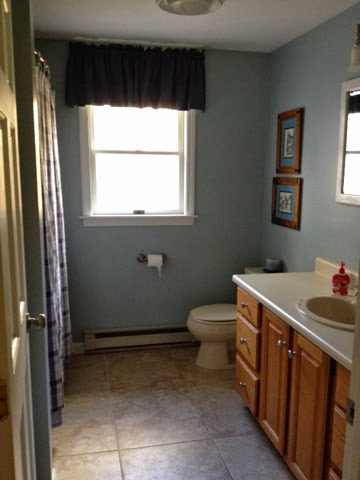
As I started cutting in I realized that our ceilings weren't white. So there goes any idea of spot painting in other rooms. At the end I don't think anyone would notice my efforts but since the bathroom was my first paint job I was happy to recut the ceilings and hide the horrible cut job I had done with the few splotches of blue on the ceilings where I hit the ceiling with my paint brush. Wow have I come a long way in 2 years. 


So now all we have left to do in here is get a new countertop and we will have actually completed our first room!

Thursday, November 13, 2014

Master Bedroom


While updating my pages tonight I realized that I never put up the master bedroom upgrades. Sadly, its been one of the most overlooked spaces in our house since we started renovating. Maybe because it didn't need much, maybe cause I wanted it to look really good. Either way, we sadly lived in a room that looked like this for most of the first year:


I don't have to show you much for you to get the full picture. Behind our bed was another splotch of a different color, the window had yet a 3rd color strip and I was really slow on painting the trim.

Where it gets sad is that after about a year, this is what we moved up to:


Most of the trim painted, still not all, and still the same paint testers. We had our curtain up and for the first time in our life an actual bedroom set. But, my husbands dresser didn't match and we still do not have a bedspread.

When you visit people's houses, its rare you head into their master bedroom. So, honestly, I have no idea what most people's bedrooms look like. But, I do know some close to me and I just love that people put time and effort into how their bedroom looks, they make it "their" space. Both my sister in laws have their rooms decorated beautifully. One even switches out her comforters for seasons. It seriously has me totally in awe. I want to put that kind of thought into my bedroom.

Sadly, we just don't really spend time in our bedroom. We sleep there (when the kids let us sleep) and that is about it. I don't have a walk in closet and so half my clothes are in the hallway closet. We had an old 90's 13 inch tv in there, so we only watched tv in there basically when my husband wanted to catch the weather or something before bed. In my head I have these grand visions of me reading, or relaxing in my beautiful bedroom retreat. But, in reality, its hard for me to get into bed without wanting to roll over and just go to sleep. All the movies and tv shows show the married couple reading, watching tv, and spending all this time in their bedroom. It hasn't been our reality, but I'm not ready to kill the idea yet.

After a lot of time on pinterest and design websites aimed at decorating/designing your master bedroom, I began to get an idea. I liked the thought of grey walls to go with my blue paisley. I also saw this pin, which helped get me to get inspired for some color pop:


It has white, grey, and both light and dark blue. What I like the most is the pop of color. As I started to visualize my bedroom in a medium to dark grey, with navy and light blue accents, I started to worry it would be too cool, too boring. Our last master was a pretty bold burgandy. Not to mention, how do I know what grey is best. The strips painted on the wall changed so much in different light, one looked purple at times and the other was just okay.

Then I found Chip It! by Sherwin Williams and problem solved! I was lucky enough to find my exact paisley online and chipped it!


This at least gave me a starting point. Because I was motivated, I wasn't willing to buy a sample and try yet another stripe on the wall. I knew it was time to go and I just dove in and went with Argos.


We were in the middle of finishing the master bathroom and I saw this as the perfect time to get motivated and at least get all the walls to a matching color. I finished painting the trim (well, most of it).


We found a cheap dresser that almost exactly matched our set to replace the oak dresser my husband was using. He scored a 32 inch flat screen SMART tv, so we can watch Netflix!! I switched out pictures of my kids for art.


Bought some art for behind the bed, using yellow as my "pop" color. A couple blue paisley laundry hampers. A yellow floral pillow, and hey, its a start. Not to mention, very inexpensive little upgrade. At least we can't say we have totally neglected "our" space.

Monday, July 28, 2014

Bathroom facelift

A while ago I posted about painting our master bathroom yellow and the dramatic change it made for us. To remind you, here is a picture of what we started with when we moved in. Not awful, but nothing nice. A few things you can't see are the metallic linoleum, the oak and gold light, oak and gold towel bars and toilet paper holder, and the non-flushing, corroded toilet.


For me to use this bathroom at all, we decided early on to get somewhere to put our towels, upgrade the hardware, and paint. The paint cost us $12 for two samples of Sherwin Williams Banana Cream, the shelves were $20 each, from target. Our hardware on the vanity I took off a desk I had refinished years ago and we were getting rid of. The toilet paper roll and towel bar were free from my parents left over. We did have to buy 1 18 inch towel bar to match and that was $31 from doorcorner.com. We went with Dynasty hardware's Sonoma collection in brushed nickel. I would definitely recommend this over what you can get at Home Depot or Lowes.


The light switch plate was $10. The curtain we had from our old house and matched the shelves perfectly. This took the bathroom from my least favorite place in the house to a room I liked a lot. It was bright, more modern, and felt more of our style. We planned on this getting us by for years and we were both okay with that.

This past week I decided to take the bathroom reno one step further and paint the mirror/medicine cabinet and stain the vanity. We hadn't talked about further changing the bathroom or had any plans off doing anything. I was brushing my teeth looking into our oak and gold medicine cabinet and realized that if I were already going to be using primer and white paint (deck painting), I might as well just touch this up. Once I painted that, I realized it wouldn't be too hard to fix the vanity also.

I looked at a few blogs to do the vanity, but wish I had just gone straight here: http://www.monicawantsit.com/2012/02/staining-oak-cabinets-espresso-color.html

The reason, was that the other blogs did not specify that you DO NOT WIPE the stain, you let it sit. After much anxiety about it not coming out how I wanted, once I read this, it was a game changer. Here is what I started with and what I end up with.


One coat:


Because I wiped the stain, 2 coats got me this streaky mess:


3 coats looked about the same giving me a very depressed feeling. Then I read to not wipe and got this:


Gorgeous!! Honestly, I was so proud and excited at how this came out. I was happy to have these two new changes get us through more years in this bathroom. But, seeing how excited I was about the vanity my husband surprised me for our anniversary with a new counter and light. Which turned into a new faucet, counter, light and toilet!!! It was obvious with the new counter we couldn't put our gold chipped faucet back on, then once we were that far, I just said forget it, lets do the toilet and call this project done (minus floors and shower door).

Yay! Full bathroom reno!!! I keep reading how the return on bathroom work is high and I think we nailed it with this. Either way, we love it and that is all that matters!!!

Ta da!!


This project wasn't without its headaches and I will post on the troubles installing the new sink/counter/etc :)

Friday, May 30, 2014

Then there was light

I can't say enough how much I love my kitchen. We have transformed this place from tiny, outdated, non-functional, and awkward to a place that I spend most of my days and nights with my family. I often stand in the unfinished kitchen just glowing at what an improvement it makes to the entire house.

That all said, there was one thing that was lacking - sunlight. With the door and the window back facing, and more importantly covered by the screened in porch, the kitchen was a dark place. The living room would be brightly lit and I'd have to come in and turn on all the lights for the kitchen.

We had an idea that a new window in the dining room could definitely transform this space. Sadly, it wasn't in our budget. The more I thought about it though, the more I realized we could do this, in budget. I knew we could probably find a used window on craigslist. Even if the window wasn't the top of the line efficient, it would be a place holder and could be replaced later. My dad and my husband would do the work, so really there wasn't much to the cost other then the window.

I found a few online, but nothing was screaming at me. So we thought we would check out the Habitat for Humanity ReStore and we scored big!!! We found this:


Brand new, in the box for $125!! After much research I found the price for this window new was $465. That's about a 1/4 of the price!

Here is the space. When I measured it, I was thinking a 4' x 3' window and that is exactly what we found. 

I was lucky enough to have my Dad and husband put it in. I'm not sure what the cost to hire someone would be. But, as you can tell, for $125 the change was immediate and awesome.
 

All we need is a little trim and its complete. I will say that there was a bit of challenge in the window due to the electricity. Our house, as you may have read before, was wired weird. So, in the middle of the wall there should have been nothing, we had an electrical line running right down the center of the wall. So we did have to get an electrician in here to fix that. But, luckily that was pretty cheap, a little over $100.


At night we can watch the deer in the woods. It's like a giant piece of gorgeous landscape art. And a bonus, is when I went to seed my tomatoes, I finally had somewhere out of the way to get some light on them.


Cheap upgrade part 2

After the chairs, I went for the rocking chair seen here:


Why stop there. We decided the old left over chair we were given for my son needed to match too.


Now all my furniture is matching and looks like new. The best part is the distressed look to the furniture which means that even if they aren't perfect, that is the design!

Wednesday, May 14, 2014

Cheap upgrade!

When we bought the house it was full of furniture and stuff. Knowing it was a second home and the previous owner was in a wheelchair. We decided to ask what would come with the house. When we could negotiate "everything" we went for it. 

First off, the furniture was from 1987. Which may get you thinking, uh outdated. I saw- SOLID wood!! Where can you find this anymore? All it takes is some love.

Check out these kitchen chairs:


Completely solid wood and the shape resembled our expensive, nice distressed chairs. A little can of spray paint:


Sand the edges and boom distressed.


A little poly and boom. Matches the rest of our furniture. Looks modern, clean. Cost: $5 at most.