Thursday, November 20, 2014

Switching it up - bedroom style

After finding ourselves completely done with lack of sleep, we decided that a change in the boys bunk beds had to happen. Unfortunately, with their giant dresser there was no way to un-bunk the beds and keep the dresser.

It became very obvious the best solution would be to give the two boys the bigger bedroom and move the baby into the smaller boys room. 

I was having a lot of anxiety about the design changes that I felt needed to happen. My daughters room had the jungle theme with a green accent wall, it could easily be a neutral start to whatever we decided to do. The boys room with it's oak trim, blue walls, bright orange closet, and sports decals- I couldn't envision it transforming into a girly room. 

My husband told me my priorities were off. The kids were sleeping better and I was concerned about decorating! But, amidst my anxiety, there was a bit of excitement. I never really loved the boys sports themed room. It wasn't coming together like I had hoped. The baby's room was cute, but, because I really wasn't willing to start new and did a lot of recycling from the boys jungle theme I found the room was also missing something. With the switch I had the chance to rethink, replan, remodel. 

I feverishly googled blue girls rooms. Here's what I came up with, here are some of my inspirations.


For the boys room, I am just beginning to figure out my plan. But I got inspired by this picture. I love adding skateboards to the sports theme. My boys love skateboarding and it definitely makes it feel more big boy.


Also, I love this:


My original plan in there room was to add a baseball wall. I love the way the black and white really add dimension here.

First thing first, we moved the furniture and again that pang of anxiety came over me. Neither of the kids stuff really worked in their new rooms. I had plenty of other projects in the house to do before redoing the kids rooms. But, I allowed the excited new possibilities get me through.

The first thing I moved on was to try to get the boys room to look more feminine. The bright orange closet and the oak trim had to go.


I used the Chip It app from Sherwin Williams and I picked out Hibiscous as the accent color to the blue. But, I had a serious freakout at the store and ended up choosing quite a bit more boldly. As I started painting it, I was nervous, but now after I've put the room together I love it. I went with ____________ because I thought it would better match the paper balloons hung by the babies crib. The best change for sure was the trim. The white trim took the blue and instantly made it softer. The bright pink closet added a girly feel. I found an old white book shelf in my parents basement to add some more white.


I think had known I would have kept my white crib and used a white dresser. The espresso just wasn't cutting it. But, with some adorable curtains (here is phase 1 of them). I think the room is coming along. I also painted a little dresser with the pink and green and teal to match the curtains.


 I used the extra fabric from the curtains as a cloth for the top of the dresser. This is where the room will stay for now.

The boys room. Other then finding some matching night stands, I had done nothing. 


What you don't see is the green accent wall on the side of the bed on the left. The whole room just doesn't match. Its been bugging me. So, in a day of - we live in New England and it hasn't been over 40 degrees in a week and we are all sick - boredom. The boys and I painted the green wall white. I was ready to get started on making this room cute.

This morning, I woke up and did this:


I love it. I love that the tan follows the whole room and gives the feel of a baseball field. I am so happy how it came out. The floor in this room is green and it actually has a purpose now as a field. I still don't know that the navy and red motif match perfectly, but definitely its coming along. Our next step is coming at Christmas, we are making the kids these skateboards.


One for each of the kids to round out the sports themed room. After searching for cool, old skate decks, and trying to recreate the adorable room above, we decided this would be the best. I think the final product will be more colorful, this was just a quick mock up. I can't wait to see how it comes out.

Tuesday, November 18, 2014

Painting the ceiling

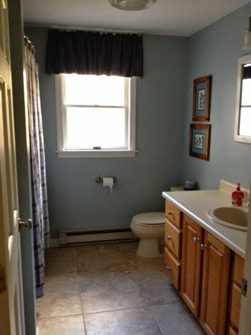
I finally got around to painting my first ceiling. I wasn't prepared for what a workout that was. I was literally shaking at the end from reaching up and contorting my body to roll this way and that. 

As I started cutting in I realized that our ceilings weren't white. So there goes any idea of spot painting in other rooms. At the end I don't think anyone would notice my efforts but since the bathroom was my first paint job I was happy to recut the ceilings and hide the horrible cut job I had done with the few splotches of blue on the ceilings where I hit the ceiling with my paint brush. Wow have I come a long way in 2 years. 


So now all we have left to do in here is get a new countertop and we will have actually completed our first room!

Thursday, November 13, 2014

Master Bedroom


While updating my pages tonight I realized that I never put up the master bedroom upgrades. Sadly, its been one of the most overlooked spaces in our house since we started renovating. Maybe because it didn't need much, maybe cause I wanted it to look really good. Either way, we sadly lived in a room that looked like this for most of the first year:


I don't have to show you much for you to get the full picture. Behind our bed was another splotch of a different color, the window had yet a 3rd color strip and I was really slow on painting the trim.

Where it gets sad is that after about a year, this is what we moved up to:


Most of the trim painted, still not all, and still the same paint testers. We had our curtain up and for the first time in our life an actual bedroom set. But, my husbands dresser didn't match and we still do not have a bedspread.

When you visit people's houses, its rare you head into their master bedroom. So, honestly, I have no idea what most people's bedrooms look like. But, I do know some close to me and I just love that people put time and effort into how their bedroom looks, they make it "their" space. Both my sister in laws have their rooms decorated beautifully. One even switches out her comforters for seasons. It seriously has me totally in awe. I want to put that kind of thought into my bedroom.

Sadly, we just don't really spend time in our bedroom. We sleep there (when the kids let us sleep) and that is about it. I don't have a walk in closet and so half my clothes are in the hallway closet. We had an old 90's 13 inch tv in there, so we only watched tv in there basically when my husband wanted to catch the weather or something before bed. In my head I have these grand visions of me reading, or relaxing in my beautiful bedroom retreat. But, in reality, its hard for me to get into bed without wanting to roll over and just go to sleep. All the movies and tv shows show the married couple reading, watching tv, and spending all this time in their bedroom. It hasn't been our reality, but I'm not ready to kill the idea yet.

After a lot of time on pinterest and design websites aimed at decorating/designing your master bedroom, I began to get an idea. I liked the thought of grey walls to go with my blue paisley. I also saw this pin, which helped get me to get inspired for some color pop:


It has white, grey, and both light and dark blue. What I like the most is the pop of color. As I started to visualize my bedroom in a medium to dark grey, with navy and light blue accents, I started to worry it would be too cool, too boring. Our last master was a pretty bold burgandy. Not to mention, how do I know what grey is best. The strips painted on the wall changed so much in different light, one looked purple at times and the other was just okay.

Then I found Chip It! by Sherwin Williams and problem solved! I was lucky enough to find my exact paisley online and chipped it!


This at least gave me a starting point. Because I was motivated, I wasn't willing to buy a sample and try yet another stripe on the wall. I knew it was time to go and I just dove in and went with Argos.


We were in the middle of finishing the master bathroom and I saw this as the perfect time to get motivated and at least get all the walls to a matching color. I finished painting the trim (well, most of it).


We found a cheap dresser that almost exactly matched our set to replace the oak dresser my husband was using. He scored a 32 inch flat screen SMART tv, so we can watch Netflix!! I switched out pictures of my kids for art.


Bought some art for behind the bed, using yellow as my "pop" color. A couple blue paisley laundry hampers. A yellow floral pillow, and hey, its a start. Not to mention, very inexpensive little upgrade. At least we can't say we have totally neglected "our" space.